
How I designed Business Credit end-to-end as the sole designer — Revolut's first SMB lending product, shipped in 8 weeks across mobile and desktop.
By 2024, Revolut Business had grown into one of the largest business banking platforms in Europe — multi-currency accounts, expense management, global payments. But there was a glaring gap in the product: no credit offering for the SMBs who relied on it day to day.
Business owners were managing their finances in Revolut, but going to their high-street bank when they needed working capital. The opportunity was clear: build a credit product that met them where they already were, without the friction and delays of traditional lending.
I was brought in as the sole designer to take Business Credit from concept to shipped — covering onboarding, eligibility, the credit dashboard, card management, and repayment flows across iOS, Android, and Web. It was Revolut's first SMB lending product, and the team treated getting these foundations right as the top priority.
Credit is categorically different from payments or accounts. Users are taking on debt — often significant amounts — and they need to understand exactly what they're agreeing to. The stakes for unclear design are much higher when the outcome is a financial obligation, not a transaction.
Determining whether a business qualifies for credit requires significant data collection. The challenge: gather what's needed without making the process feel like a compliance exercise rather than a product.
Revolut Business lives on iOS, Android, and desktop Web — with different usage patterns on each. The credit experience needed to feel native everywhere without fragmenting the design.
Revolut's design language is fast and confident. Credit needed that same energy, but with more transparency — rates, limits, repayment schedules — without it feeling dense or intimidating.
This wasn't just one feature — it was the foundation for Revolut's entire business lending category. Decisions made here would shape everything that followed. Getting the patterns right mattered.
Working alone with a focused product and engineering team, I ran design in tight sprints. The priority order was deliberate: get onboarding and eligibility right first, because every other part of the product depends on users successfully reaching a credit offer.
The eligibility journey was the highest-priority surface. Designed a step-by-step application that collected business information progressively — revenue, trading history, account age — without overwhelming users upfront. Clear progress indicators, inline guidance on why each piece of information was needed, and a fast path to a credit decision.
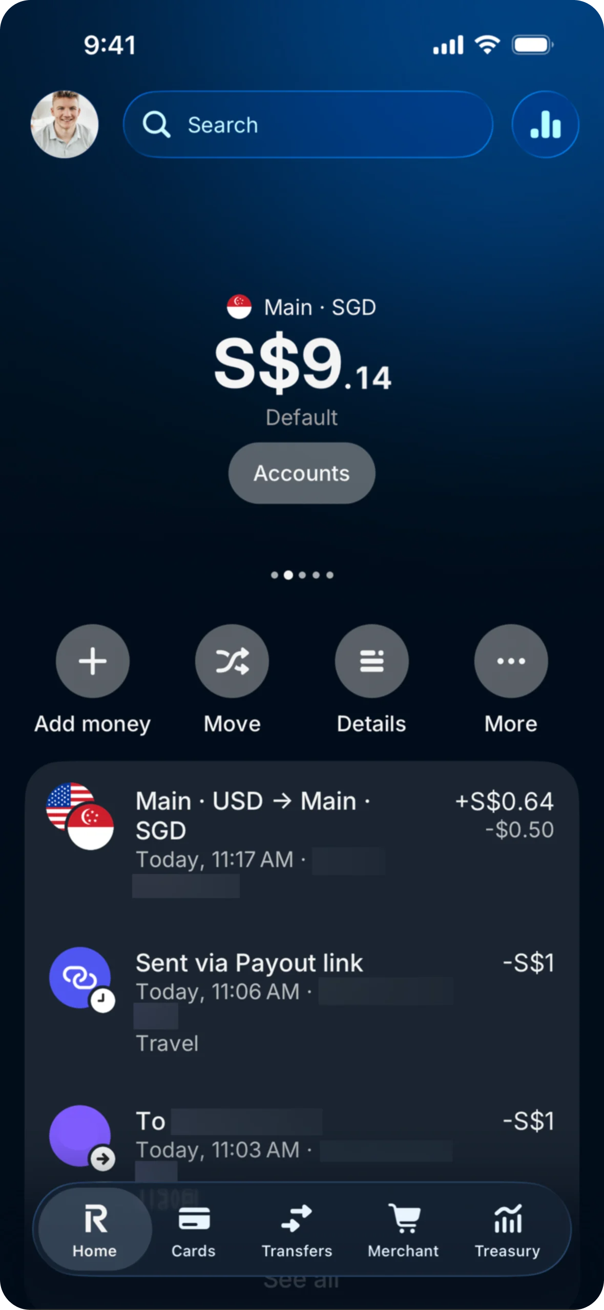
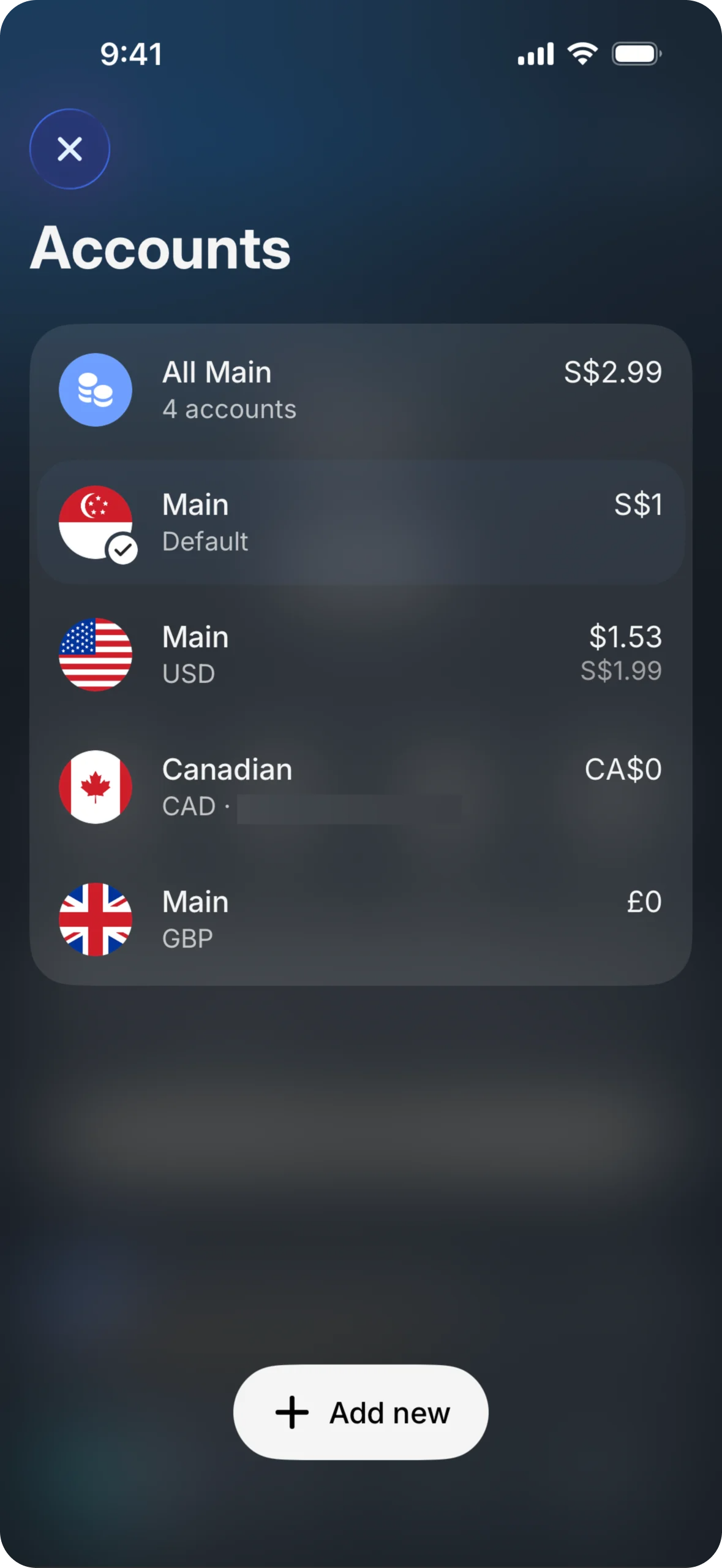
The dashboard needed to communicate four things at a glance: available credit, current balance, next repayment date, and account status. I designed a module-based layout that scaled across mobile and desktop, with a utilisation indicator that made credit health feel intuitive — not just a number, but a clear signal.
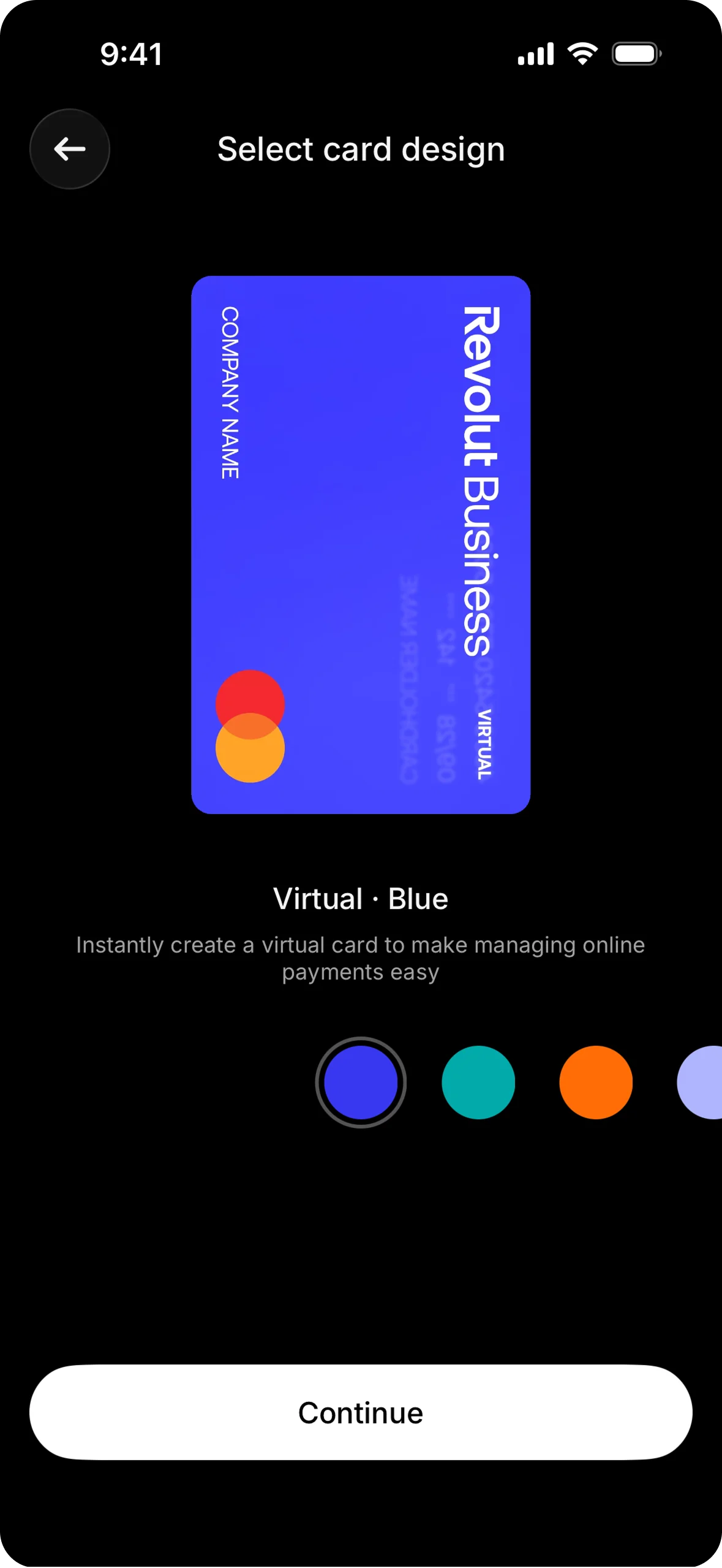
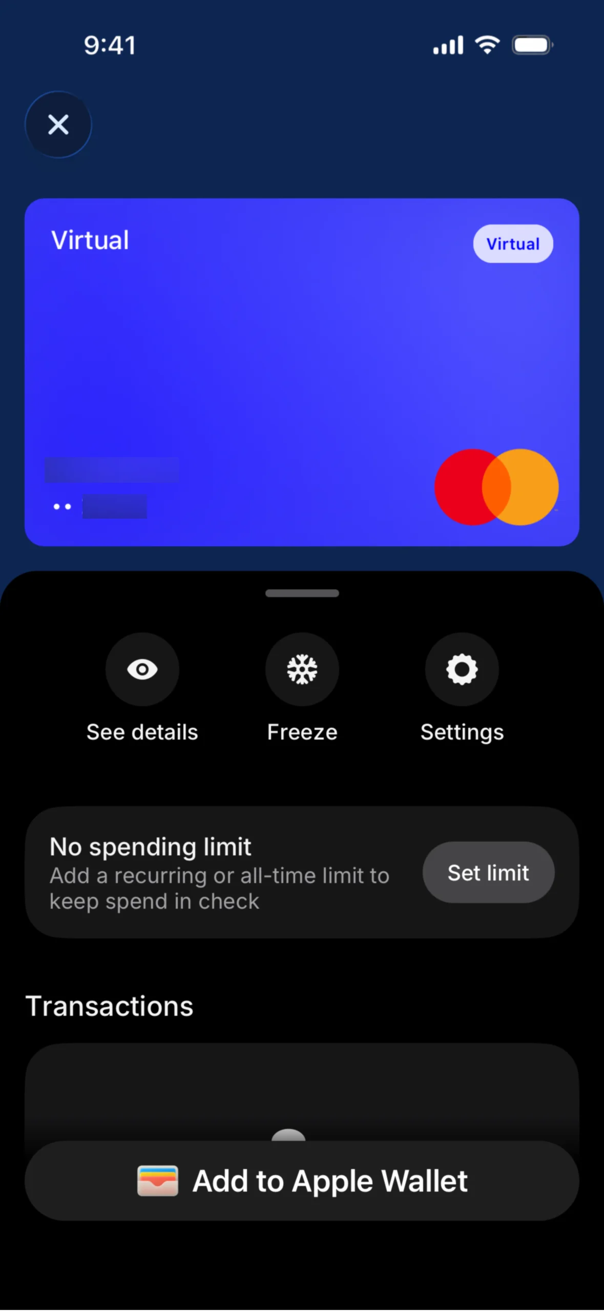
Designed the physical and virtual card management experience: freeze and unfreeze, spending limits, Apple Pay and Google Pay setup, transaction history filtered to the credit card. Cards were one of the first priorities because they are the most tangible part of a credit product — the moment it becomes real for the user.
Repayment needed to be as frictionless as possible. Designed one-tap full repayment, custom amount flows, and automatic repayment scheduling. Monthly statements surfaced spending by category to help business owners understand where their credit was being used and plan accordingly.
A progressive application flow that collects business information in steps, surfaces a personalised credit offer, and guides users through account setup without friction.

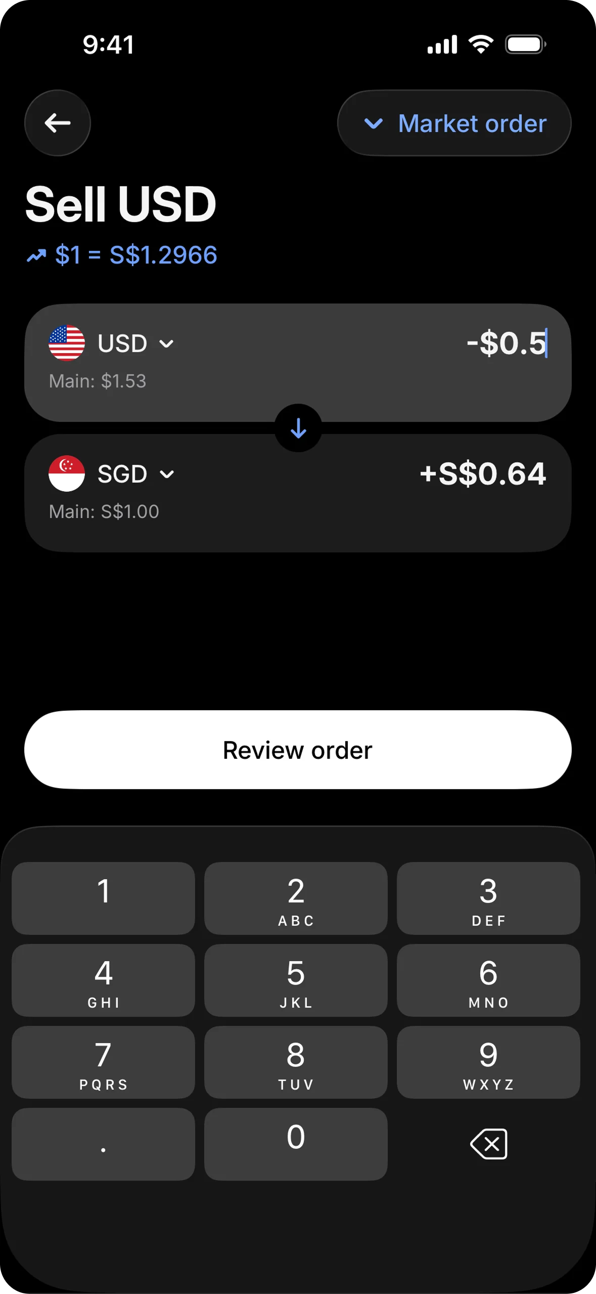
Physical and virtual card management: freeze controls, spending limits, Apple & Google Pay setup, and transaction history. Cards were first priority — the most visible proof the product is real.
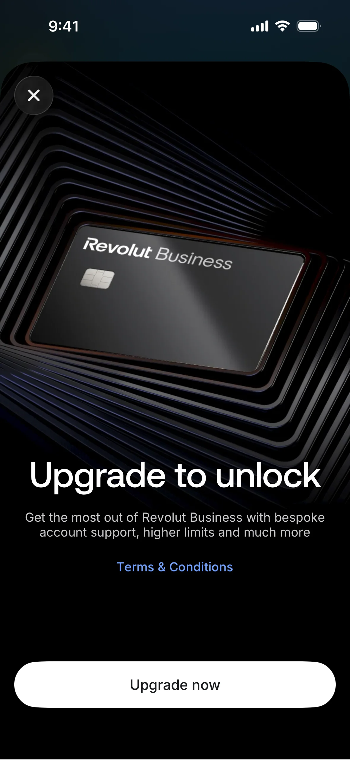
One-tap repayment, custom amount flows, automatic scheduling, and monthly statements with spending by category. Making repayment feel as easy as spending.
Onboarding first, everything else second. The team consciously sequenced onboarding and eligibility before dashboard polish or secondary features. No amount of great card management UX matters if users cannot get through the application. We treated conversion through the eligibility flow as the single most important metric in the first sprint.
Progressive disclosure over information density. Credit products carry a lot of information — rates, limits, terms, repayment schedules. I made the deliberate choice to surface the most important number prominently and put everything else one tap away. The risk of overwhelming users at the decision moment was higher than the risk of them not immediately seeing every detail.
Cross-platform from day one. Rather than designing mobile-first and adapting for web later, I ran all three platforms in parallel. Revolut Business has a significant desktop user base — business owners managing finances at their desk — and a product that felt half-finished on web would have undercut the launch.
Building the category, not just the feature. Because this was Revolut's first lending product, every design pattern I set would become the template for what came next — business loans, overdrafts, working capital. I designed the component system and interaction patterns with that in mind, not just optimising for the immediate brief.
"Credit is different from every other financial product because the user is taking on an obligation, not just moving money. The design has to earn trust at every step — not by being cautious, but by being completely clear about what is happening and what comes next."
The most important thing I took from this project is that pace and quality aren't opposites if you sequence the work correctly. By betting on onboarding and eligibility first, we ensured the product could actually reach users — and everything built after had a solid foundation underneath it.
Designing the first product in a new category is a different kind of challenge. You're not just solving the immediate brief. You're setting the patterns that every future product will inherit. That responsibility shaped every decision — from how credit limits are displayed to how repayment is confirmed.